RICH SKIPWORTH’S TIPS, TRICKS, AND NERDY TECHNO-BABBLE
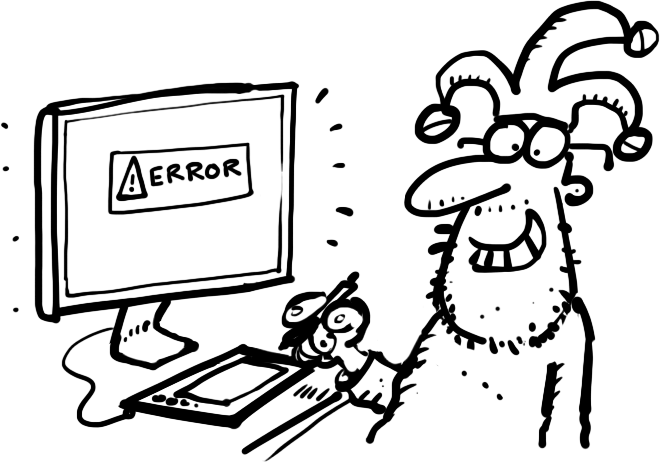
One thing that was very popular at the recent Malta Minicon was the “Cartoon Mentoring” session. Some of the lesser experienced cartoonists teamed up with the hard bitten long-in-the tooth professionals for some one-to-one advice on cartooning technique. I paired up with Mitch Mitchell, who was very interested to learn about shading. Mitch was often a bit daunted how to add shading to his cartoons to avoid them looking like just flat pieces of linework. He felt his cartoons would benefit from some shading to make things stand out and make them clearer to read, but he wasn’t sure how to go about it. It struck me that this may well be a common problem with a lot of beginner cartoonists. I remember when I first started cartooning, I would be very reluctant to add shading or colour to my linework in case I messed the whole thing up. So…I thought this might be a useful topic for this month’s “How Do”…
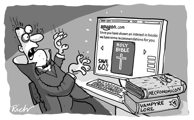
It’s not always necessary to add shading to a cartoon. Plenty of cartoons look great as just simple open black line illustrations. But often they can be improved and given more visual punch with shading applied. Here’s an example: The top pic shows the basic open line version of my cartoon of Dracula browsing Amazon books online. Looks ok, but with some shading added it really stands out on the page..

So how do you decide where to put the grey tones, the shading?
First you need to consider what is important in the cartoon, what parts of it really carry the gag. Second, you need to consider where the light source of your cartoon is. In this case, the important bits are the computer screen, and the reaction of Drac to the image on screen. The light source in the picture is easy to work out, it’s the screen. Anything that’s illuminated by the light source will catch the eye and stand out, but make an object appear illuminated, you need to add a contrast between the object and the background. In other words, lighten the bits you want people to notice, darken the rest. You just have to imagine the light hitting your object, and imagine how it might look. Here’s the steps involved in the Drac cartoon shading:
1. With the Drac cartoon, I added a flat grey to the background which immediately threw everything else forward.
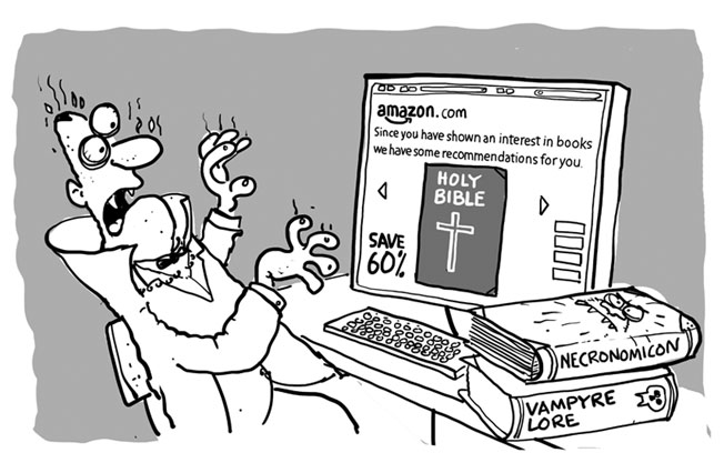
2. Drac wears a dark suit, so the grey of the backgound needed to be lighter than the suit.
3. Next came some shading to indicate how the light was falling on Drac. Just adding some greys to the parts of the figure away from the light source did the trick.
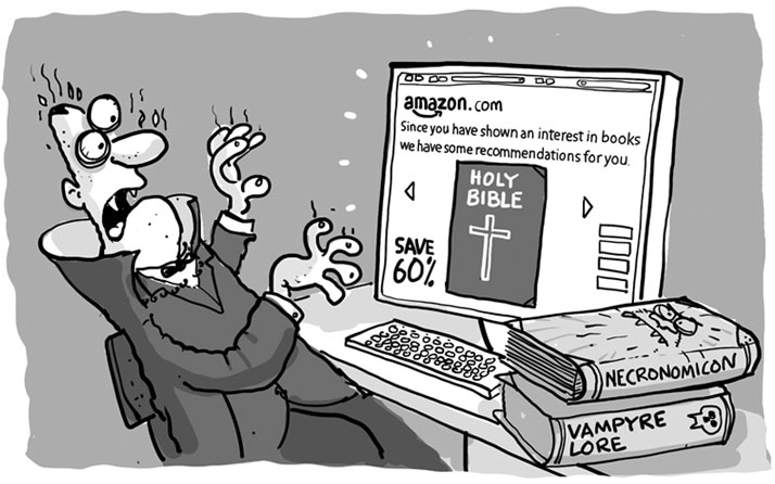
4. Next, I dulled down the auxilliary details of the cartoon, which in this case were the books on the desk and the desk itself. They were secondary to the gag, so a bit of grey reduced their prominence, and kept the focus on Drac’s face and the screen. A little extra shading in the form of a dark curve running over the top left of the background gave extra emphasis to Drac’s face by increasing the contrast between his eye area and the background.This also gave a rough impression of the light falling away from the screen towards the left edge of the cartoon, so giving a bit more emphasis on the screen itself.
In all these steps I’m constantly trying to get the reader’s eye to be focussed on the important bit: the gag itself Shading of this type is easy when working digitally. For this cartoon, all the shading was done on separate layers in Photoshop, with each layer set to “Multiply” The opacity of all these shading layers could be adjusted to give the best balance between the various tones. Working on paper with pen and ink is a bit trickier of course. I always used to work out the shading positions by overlaying a sheet of tracing paper on the cartoon linework and quickly sketching in the shading with a pencil. Once I was happy I’d got things roughly right I’d use the overlay as a guide and add the tones for real using grey washes of watercolour.
This article first appeared in issue 496 of the Cartoonists’ Club of Great Britain magazine ‘The Jester‘
THANK YOU FOR PRESENTING THIS ARTICLE ON ‘SHADING’ IT WAS VERY HELPFUL
I’M STILL USING THE OLD ‘INSTANTEX’ PRE-PRINTED SHADING THAT IS RUBBED ONTO THE PAPER – BUT I CANT FIND A SUPPLIER OF SIMILAR ITEMS . COULD YOU PLEASE ADVISE OF ANY POSSIBLE CONTACT
I NOTE YOUR COMMENTS ON USING PHOTOSHOP LAYERING SO I WILL HAVE A RUMMAGE AROUND MY ‘PAINTSHOP’
MANY THANKS
VIC
I am embarrassed to ask this question,but how do you do layering? I draw for my own amusement in black and white on paper,then scan to computer. I don’t want to spend a lot on expensive software designed for serious cartoonists. Is there simple software available which is easy to use?
Thanks