 RICH SKIPWORTH’S TIPS, TRICKS, AND NERDY TECHNO-BABBLE
This article first appeared in The Jester issue 472.
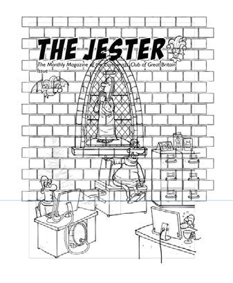
This issue, I’m going to attempt to show the essential steps I went through to complete a cover illustration for The Chistmas Jester in 2013. The theme was “Saints and Sinners” and Ian had asked that I do a cover featuring my Monks characters. Here’s how the whole thing went (I’ve simplified it a bit to fit everything in and to avoid boring you all to tears…)
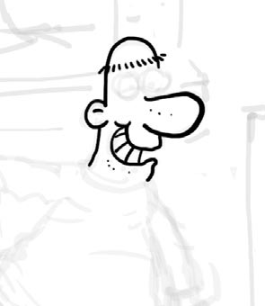
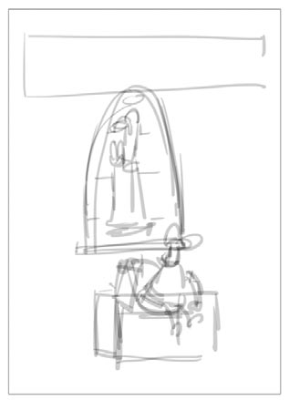 1. I had a basic idea fairly quickly. Here’s my first sketch In Photoshop
 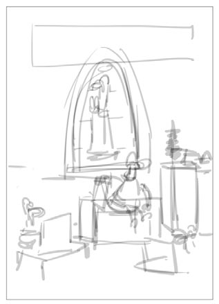 2. I thought it needed a bit more going on, so I scribbled in some more.
 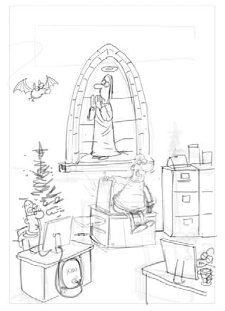 3. Those loose scribbles were enough to tighten the detail on another layer.
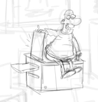
4. Opacity of the sketch layer is dropped to about 20% and inking is done on a layer above
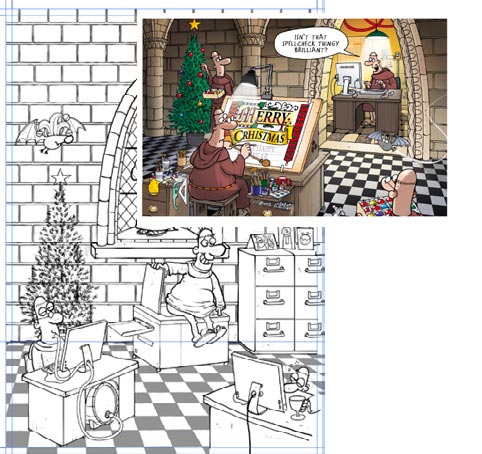
 5. Some backround detail is manufactured in Illustrator, like the background wall blocks. This pattern is”expanded” so the lines become filled areas, and then a “Roughen” effect is applied. The result is copied and pasted back into Photoshop
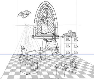 6. Here the floor tile pattern is created in Illustrator, roughened, and copied & pasted into PS. The opacity of the pattern is lowered so I can see what’sgoing on,and then the Free Transform tools are used to bend the pattern to fit the perspective of the scene.
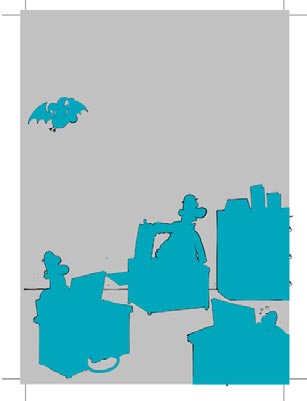
Having a distinct pre-prepared layer to accept the colour allows the colouring to proceed very quickly. You can use rapid strokes without fear of “going over the edges”.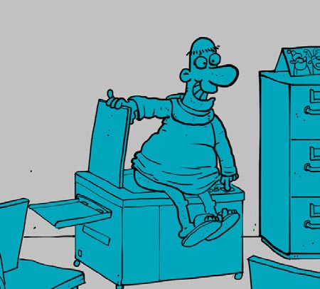
9. To maintain a consistent palette with my Monks cards I’ll often use a previous design and select key colours from it using the eye-dropper.

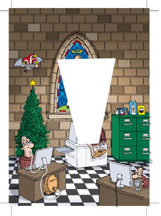

Working on layers is the key to the whole process, though I probably over do it. For this illustration I wound up with 35.
More nerdy stuff next time!
Happy Christmas!


A masterclass in digital cartooning – brilliant!