Tag Archives: tutorial

How Do You Do That Then? – Christmas Cover

How- do you do that thenRICH SKIPWORTH’S TIPS, TRICKS, AND NERDY TECHNO-BABBLE

This article first appeared in The Jester issue 472.

This issue, I’m going to attempt to show the essential steps I went through to complete a cover illustration for The Chistmas Jester in 2013. The theme was “Saints and Sinners” and Ian had asked that I do a cover featuring my Monks characters. Here’s how the whole thing went (I’ve simplified it a bit to fit everything in and to avoid boring you all to tears…)

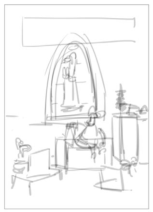
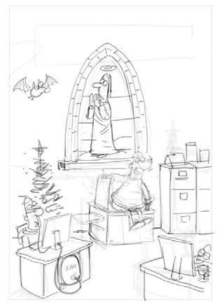
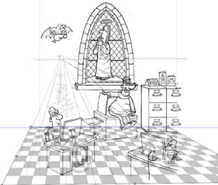
[threecol_one] how to xmas cover step 11. I had a basic idea fairly quickly. Here’s my first sketch In Photoshop [/threecol_one] [threecol_one]how to xmas cover step 22. I thought it needed a bit more going on, so I scribbled in some more. [/threecol_one] [threecol_one_last]how to xmas cover step 33. Those loose scribbles were enough to tighten the detail on another layer. [/threecol_one_last] [hr] [threecol_one] how to xmas cover step 4a how to xmas cover step 4b
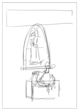
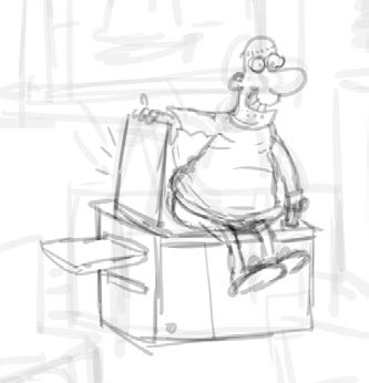
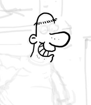
4. Opacity of the sketch layer is dropped to about 20% and inking is done on a layer above [/threecol_one] [threecol_one]how to xmas cover step 55. Some backround detail is manufactured in Illustrator, like the background wall blocks. This pattern is”expanded” so the lines become filled areas, and then a “Roughen” effect is applied. The result is copied and pasted back into Photoshop
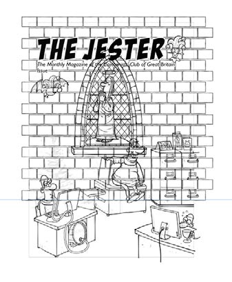
[/threecol_one] [threecol_one_last] how to xmas cover step 6 6. Here the floor tile pattern is created in Illustrator, roughened, and copied & pasted into PS. The opacity of the pattern is lowered so I can see what’sgoing on,and then the Free Transform tools are used to bend the pattern to fit the perspective of the scene.[/threecol_one_last] [hr] [twocol_one] 7. When the inks are done, a separate layer is created above it and the main areas are filled with a flat colour. how to xmas cover step 7 [/twocol_one] [twocol_one_last] 8. This layer then has its transparency locked, and is dropped below the inks layer. It is then filled with white. This layer will then receive the majority of the full colour work for the illustration.
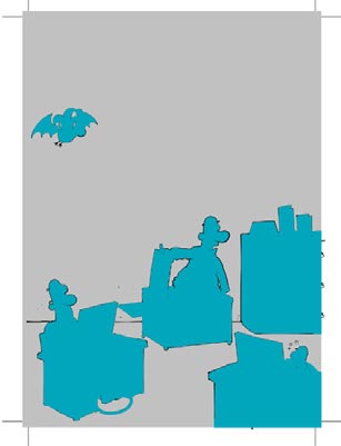
Having a distinct pre-prepared layer to accept the colour allows the colouring to proceed very quickly. You can use rapid strokes without fear of “going over the edges”.how to xmas cover step 8 [/twocol_one_last] [hr] 9. To maintain a consistent palette with my Monks cards I’ll often use a previous design and select key colours from it using the eye-dropper.
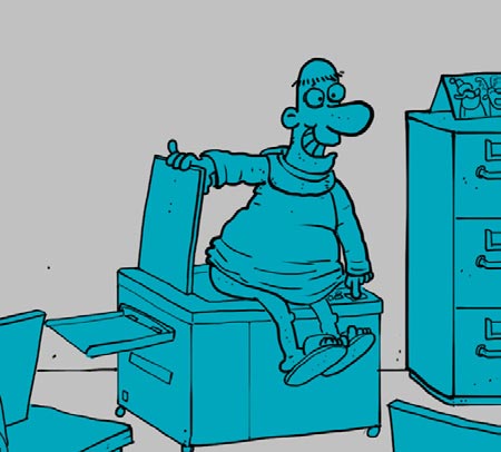
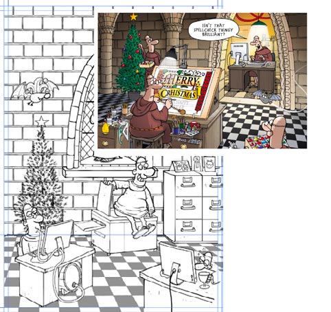
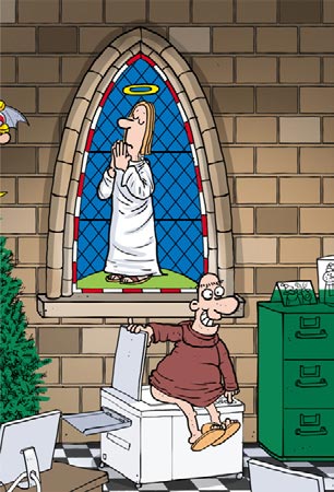
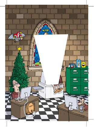
how to xmas cover step 9how to xmas cover step 9b [hr] [twocol_one]10. For the photocopier light effect, I created a new layer and filled a trapezoid shape with white. This was then given a Gaussian Blur of a few pixels and dropped behind the character… how to xmas cover step 10a[/twocol_one] [twocol_one_last]11. …A layer mask was applied to this layer, and black was airbrushed onto it which had the effect of reducing the opacity where the black was applied. On another layer, on top of the character, I carefully airbrushed some white to give the impression the light was leaking around the Monk’s bum. how to xmas cover step 11[/twocol_one_last] [hr]
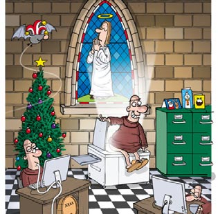
Working on layers is the key to the whole process, though I probably over do it. For this illustration I wound up with 35.

More nerdy stuff next time!

Happy Christmas!

jester cover 472

How Do You Do That Then? – Vanishing Point

How do you do that then?

RICH SKIPWORTH’S TIPS, TRICKS, AND NERDY TECHNO-BABBLE

This article first appeared in The Jester issue 466.

I am a Cartoonist these days. But before I was a cartoonist I was a Graphic Designer, and before that I was a Frozen Mackerel Packer. I am often called upon to combine the first and second of these skills when I produce work for various giftware companies. (No call yet for freelance cartoon mackerel packing graphics though…ah well.) Part of my giftware design job involves producing posh visuals to clients to persuade them to part with money. There’s a handy Photoshop filter that makes the design of packaging and products much easier. It’s the little known Vanishing Point Filter, and it’s dead good.

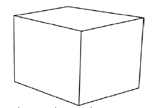
The Vanishing Point Filter in Photoshop is a means of applying graphics to your illustrations in perspec-tive interacively. It’s handy for applying lettering or logos to angled surfaces in a convincing way. Suppose you want to apply some logo or image to a simple shape. First, draw your simple shape:

figure.1


Next, draw your logo or whatever you want to apply to your shape:

figure.2

Next, select and copy that logo. Then deselect it.Then, the interesting bit….from the Filter menu at the top of your screen choose Vanishing Point.

Your screen changes, and you are presented with a new window with a spartan set of tools at the top left. Your simple shape is visible. You have now entered the mysterious Vanishing Point mode.

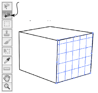
Select this tool from the palette and then click one corner at a time on a face of your simple shape. After three clicks, a blue grid will appear:

figure.3

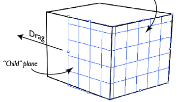
Now position your cursor over a mid point marker of the grid and hold down the Cmd key on a Mac or the Ctrl key on a PC. The cursor will change to an arrow with a small grid next to it. Click and drag.Magically, the grid is extended perpendicular to the original (or “parent”) plane.

figure.4

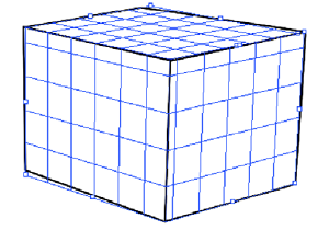
Repeat the process to complete the grid over the visible surfaces:

figure.5

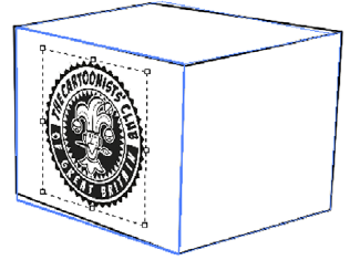
Next, paste your logo that you copied earlier. The blu grids will change to big blu rectangles, and your logo will appear top left of your screen with a selection marquee around it. Press Cmd T (on a Mac) or Ctrl T (on a PC). This invokes the Free transform command which gives little control points at the corners of that marquee. Click on one of those points, hold down Shift and drag to resize your logo. Make it quite small. Then release the Shift key and drag the logo onto your formerly gridded up shape.

When the logo coincides with one of the faces it will be distorted into the correct perspective for that face:

figure.6

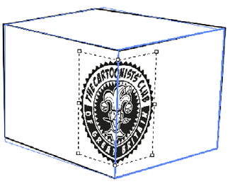
Now try dragging the logo onto another face. As the logo crosses the join between faces, it once more is distorted to match the perspective:

figure.7

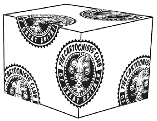
Holding down the Alt key while dragging allows tou to copy the logo as you drag, allowing you to build up a patterned surface:

figure.8

When you’ve finished adding and distorting logos and graphics, click OK and you’ll exit the Vanishing Point mode and return to normal with your distorted artwork now in place.

I’ve cheated a bit in this tutorial… I arranged things so that my original shape actually was in perspective to start with which meant the Parent/Child plane thing worked easily. You may have shapes which don’t have their faces at right angles to each other. You can simply not bother with generating Child planes and simply click and create an entirely separate planes all over your shape. The logo will still distort as before  but it won’t flow around corners. There is a further trick up this filter’s sleeve though. Select the topmost tool in the palette this time. Now when you hover your cursor over a Parent plane’s mid point marker, hold down the Alt key. (Just click a plane first to make it active)

This time the cursor will change to a double ended curved arrow. Then click and drag while keeping the Alt key depressed and the Child plane can be rotated as if it was hinged along the Parent plane. This is dead handy for matching non rectangular shapes.

Here’s a few Top Tips for this Vanishing Point malarkey:

  • If you make a mistake while setting up a plane, hit the Backspace key and your last plane corner point will be deleted.
  • Create and select a new blank layer before you enter Vanishing Point mode. Then any artwork you create in that mode will appear on it’s own separate layer when you click OK and return to normal mode.
  • When you select a Vanishing Point tool, check the little panel near the toolbox and you’ll see a line of info telling you (roughly) what that tool does and how to use it.

More nerdiness next ish!