Category Archives: How’s that Work Then?

Rich Skipworth’s ‘How’s That Work Then?” which appears in the club magazine The Jester.

That Clip Studio … How’s that Work Then? … Fill Tools

Fill Tools

First appeared in Issue 542 of The Jester, June 2020

Like most painting and drawing software, Clip Studio comes equipped with a Paint Bucket Fill tool, useful for filling areas of your illustration with flat colour.

Fill tool icon


Clip Studio’s paint bucket (or Fill tool as it’s referred to in Clip Studio) has a useful feature that I stumbled upon recently: it can make use of a thing called a “Reference Layer”

When you select the Fill tool, you should see the default Sub Tool [Fill] panel pop up. If not, go to the Window menu at the top of the screen and select it from there. It looks like this:
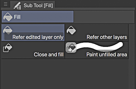
The default Fill tool is the “Refer edited layer only” which will only fill colour into closed areas on the layer those areas are on. So if you draw a square on Layer 1, the Fill tool will only fill that square on Layer 1.
Normally, you’d want the colour to be filled on a different layer, ie if you had your linework on one layer, you would like to use the fill tool to add colour on another layer below the linework layer, but using the linework layer as the layer that controls where the fill takes place.

You can achieve this by selecting the “Refer other layers” option his Fill tool version responds to the presence of shapes and lines on all the other layers in your artwork, so you could create a layer below your linework, click in the linework layer and the fill colour would appear on the layer below.

But there are times when you could do with a little more control than this, and sure enough Clip Studio, with its seemingly obsessive attention to control detail, provides this.

With the Refer edited layer only Fill tool selected, go to the Window menu and select Tool Property [Refer edited layer only] The Tool Property panel appears:
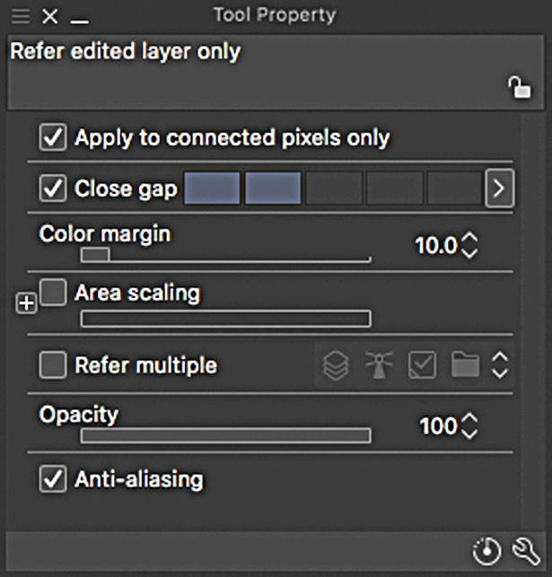
Click the little checkbox in the Refer multiple section and some new icons appear. Click on the little symbol that looks like a lighthouse:

     ->   

This is the Reference Layer icon. When this is selected, the Fill tool will now only respond to the shapes and lines on a layer designated to be the Reference layer. You can fill on any layer, but the tool will take its instructions from the Reference layer.

You can designate any layer to be your reference layer by going to your Layers palette, selecting a layer, and then clicking on the lighthouse icon in that palette:

Typically, your linework layer would be the reference layer, but it could be any one you choose.

You can only have one Reference layer active at a time, and it will be indicated by a lighthouse icon next to its name in the Layers palette.

Another setting that is useful to have for this version of the Fill tool is the Area scaling setting. Click the little checkbox in that section to activate it, and set its value to 2.
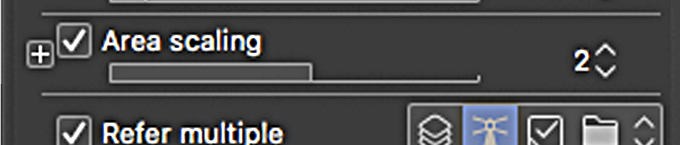
What this setting does is to expand the area that the fill will occupy once it reaches the edge of an enclosed area. So in this case, once you click in an enclosed area on the reference layer with the layer below it active (ie the colour layer) the fill will not just fill the area you’ve chosen, but will extend itself by a further 2 pixels. This means that there will be no annoying white gap between the edge of the fill and the edge of the linework shape.

The fill has a 2 pixel “bite” into the linework edges.

Bigger positive values will give more bite, but you can apply negative values too, which will generate a gap between the linework area and its fill. (sometimes you want that effect).

Click on the little + icon to get options on how the corners of the fill appear.
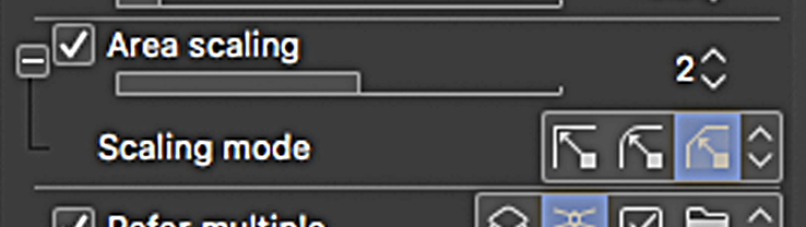
Options for the types of corners of the fill

Now you have altered the settings of the Fill tool, it no longer behaves like its old self. But you can revert the settings back to the default by clicking on the icon

next to the spanner icon at the bottom right corner of the Tool Property panel. Before you do that,

you might like to create a copy of your altered Fill tool for future use. Just click on this icon at the bottom right corner of the Sub Tool [Fill] panel
A panel will appear giving you the option to rename this copy and even give the new icon a colour. (There are numerous other options you can tinker with too if you have a couple of hours to spare).

When you’ve done that, return to your original Fill Tool and revert its setting back to the default.

Alternatively of course, you could have made the copy first and then altered the settings.

There is another default tool in the Fill Tool panel that is a really

nifty one. I haven’t seen its like before. It’s the Paint unified area tool.

Sometimes when you’re using the Fill Tool to fill a shape that has some really awkward narrow sections, the fill will often not go completely into the extremes of these narrow bits.

You get left with an annoying gap that you usually have to correct with careful application of the Brush Tool
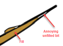
Unfilled example

To fill in these annoying gaps, Select the colour layer your fill is on, then choose the aforemen- tioned Paint unified area tool. Place your stylus tip onto an area of the succesful fill colour and without lifting your stylus simply scribble over the unfilled area.

The tool leaves a trail like a green highlighter marker while your stylus is in contact with your tablet .
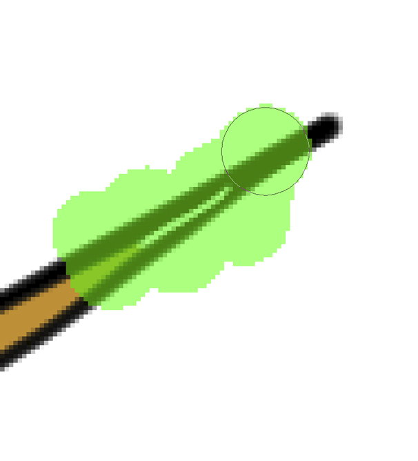
When the whole unfilled section is covered, lift your stylus from your tablet (or screen if you’re drawing direct onto one). The green highlighting will disappear and that annoying unfilled area will be filled!

Whoa! Awesome!
More nerdiness next month chums!
That clip studio …. How’s that work then? … Selection Launcher

Eich Skipworth October 2019 1

RICH SKIPWORTH’S VOYAGE INTO THE UNKNOWN!

This Article appeared in Issue 36 of  The Jester magazine, October 2019

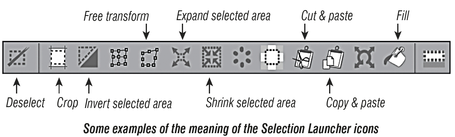
Whenever you have something selected in Clip Studio, you get this curious little row of icons appearing underneath the selection area.

This is the Selection Launcher.

If you don’t see it when you have an area selected, choose ‘Selection Launcher’ from the View menu at the top of the scree. I’ve found it to be pretty handy. It gives you quick access to all kinds of functions that can affect the selected area. Each function is represented by an icon in the palette and if you hover your cursor over an icon, a small piece of text will appear
to inform you what function the icon represents.

Like everything else in Clip Studio, the Launcher is endlessly editable.

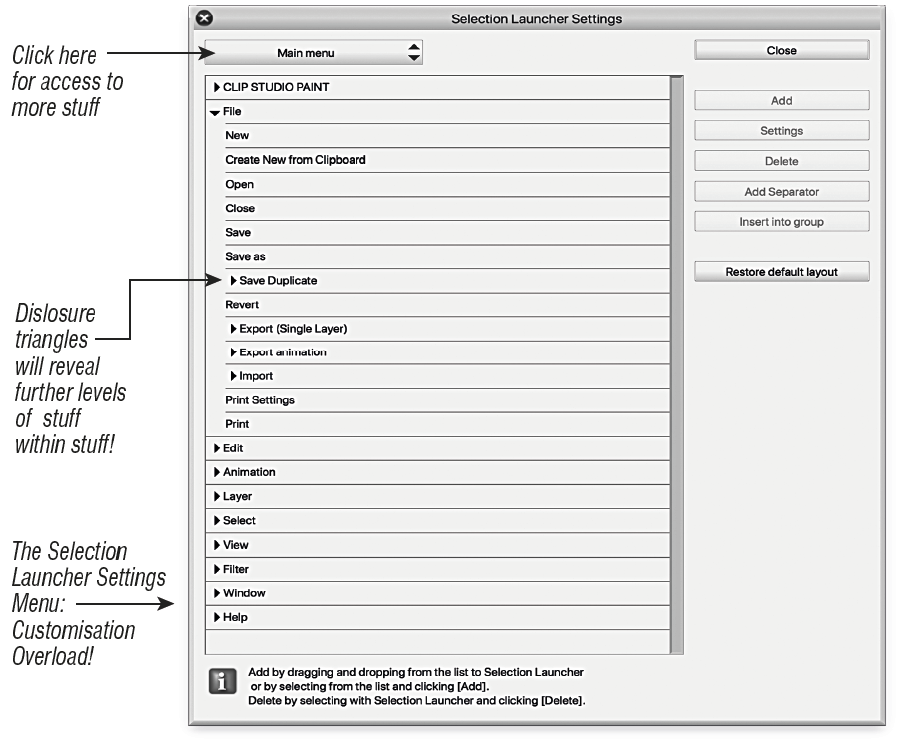
The best way to customise it is firstly make sure the Launcher is visible, then from the View menu choose Selection Launcher Settings…  This will bring up the Selection Launcher Settings menuwhich will give you access to just about all the tools and functions that Clip Studio has.

Selection Menu

To add anything from this menu to the Launcher, simply drag and drop into the Launcher, or select something in the Selection Launcher Settings list and click the ‘Add’ button. To delete something from the Launcher, click on it in the Launcher to highlight it, then press ‘Delete’ in the Launcher Settings window.

There’s also a handy ‘Restore default layout’ button.

The Selection Launcher can prove to be really convenient and useful especially if you work on a large screen, or maybe on two screens with a lot of your palettes on the second one.

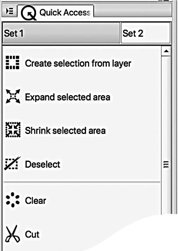
Now just to make things more confusing, there is another palette which also gives you a customisable list of tools and functions. It can contain all the same stuff as the Selection Launcher, or you can choose another set entirely. Or several sets.

This second palette that gives you quick access to functions and tools is known as the, er, Quick Access palette. It’s a permanently visible palette, ie not a floating one that appears only when a selection is active.

To see it, go to the Window menu at the top of your screen and choose Quick Access.

Customise it by choosing Quick Access settings from the bottom of the menu, or via this corner icon. A similar menu to the Launcher Settings menu appears, allowing you to drag and drop anything into the Quick Access menu.

Rich Skipworth's How to column

Actually you need to specify how the drag and drop works by choosing ‘Change order’ from the drop down menu from the corner icon. You can choose to have just ‘Drag’ or (on a Mac) ‘cmd-drag’

You can drag and drop (depending on your choice of how that works) from the Quick Access palette straight into the Selection Launcher, and also rearrange the icons in the Launcher by dragging (again depending on your settings).

Rich Skipworth October 2019 4


That Clip Studio … Mannequins .. How Do they Work then?

Rich Skipworth’s Voyage into the unknown

This article appeared in ussue 534 of the Jester Magazine, September 2019

In the course of rummaging about in Clip Studio’s menus and palettes, I stumbled upon something quite amazing. 3D stuff! It’s built in to the software, and it’s gob-smacking!

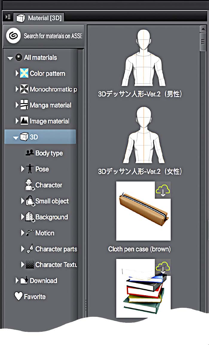
Material [3D] menu

Open up a new canvas in Clip Studio, then from the Window menu, drag down to Material, then choose Material [3D] Something like this turns up.

3D Menu

The Material 3D menu

The icons on the right hand side represent all the 3D “materials” available. A “material” in Clip Studio is basically something you can use in an illustration. It may be a pattern, a texture, or in this case, a 3D object.

There’s quite a long scrollable list, and some of the icons have a small cloud & arrow symbol in their top right corners. These are materials that can be downloaded for free from the Clip Studio server. The icons without the cloud/arrow symbol are materials that you already have installed.

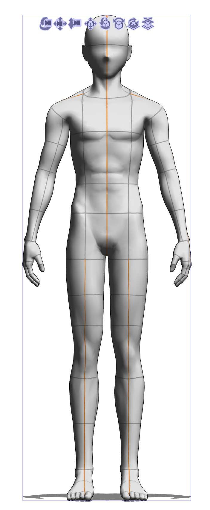
Click and drag the torso icon at the top of the list into your new blank canvas and you wind up with a picture of a human figure, a bit like one of those poseable wooden mannequins you used to get for help with figure drawing, but far more lifelike. There’s a female version too.

Scroll down the icon list and you’ll find several other poses.

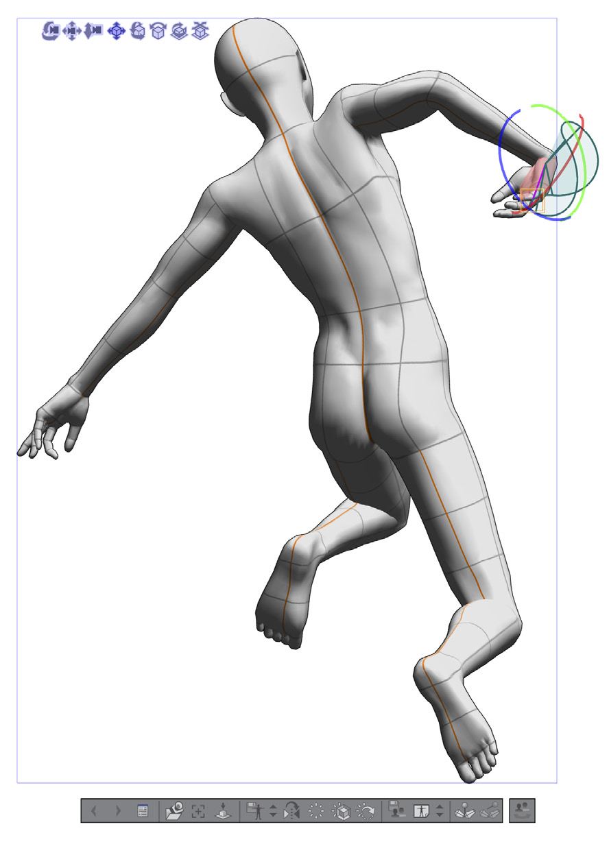
The amazing thing about these mannequins is that they are both fully poseable and are actually 3D objects that you can rotate, tilt, and scale. And by fully poseable, I mean fully poseable! You’ll notice the figures have a grid on them. Click on any of those grid squares and an area of the figure will be highlighted. Then just drag on that highlighted area and you’ll be able to bend the figure and pose it exactly how you want, even down to the positions of the fingers!

3D poseable mannequin
The 3D poseable mannequin

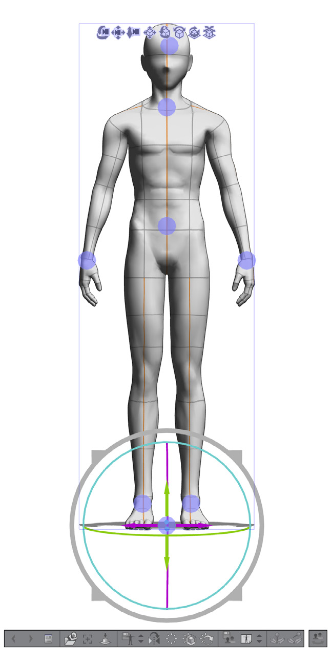
A single click on a figure brings up a set of basic positioning controls that look like concentric rings.

3D mannequin axes

The positioning controls

When your cursor hovers over any of the rings, the ring will change colour, indicating that it is now active. Just drag to see the effect. The outer ring, for example, allows you to scale the figure. Others allow you to tilt, rotate or move the whole figure in perspective 3D space.

A further click on a highlighted body section will bring up similar edtiting controls for just that section.

Customising the Mannequin

Now click on this icon that’s at the far right of the little toolbar underneath your 3D figure.

3d pose icon

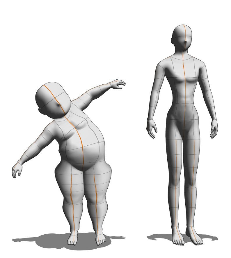
This opens up a contol panel that allows you to modify the actual body shape. You can elongate the body, make it thinner, fatter, with a stupidly big head or possesed of huge thighs! The amount of customisation you can apply to these figures is amazing. The controls for everything are too numerous to mention here, so I recommend just experimenting with all the 3D tool icons you can find. When your figure is as you want it, you can use it as the basis for a drawing on another layer.

Mannequin Variations

Modify the body shape


3D icon tools

Modify the pose


That CLIP STUDIO … How’s that work then?

Clip Studio Article

By Rich Skipworth

This article appeared in Issue 533 of The Jester magazine, August 2019

** Click on any image to enlarge ***

I’ve been tinkering with some of the default pens in Clip Studio, and one I found a joy to use is the Mapping Pen. It’s incredibly responsive. Clip Studio seems to take full advantage of all the 1000 plus levels of pressure sensitivity of my Wacom. More so than Photoshop seems to.

Here’s some of the Pen settings malarkey I found to be cool and nifty…


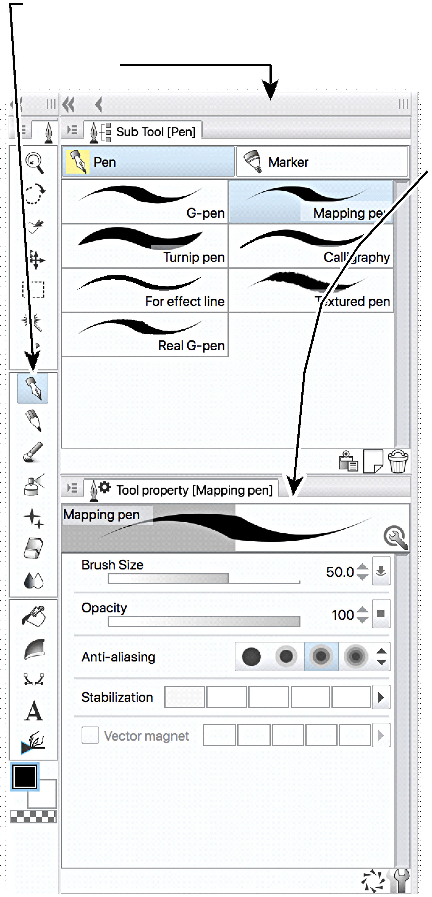
Pen palette

Hit P on the keyboard, or click the pen icon in the toolbar and the Pen palette appears

Hit P for pen palette

This reveals the default set of pens and markers. Click the pen tab to get the pens visible.

The pen variants on display, G-pen, Turnip pen (wha?…) etc are referred to as “sub tools” of the main Pen type. It’s always handy to have the Tool Property palette visible. You can make it available via the Window menu at the top of the screen. This palette gives you control over the size of the pen, its opacity, its anti-aliasing (i.e. how smooth the edges of your line look) and the Stabilization, which is how closely the pen matches your hand movements. This can give you nice smooth curves at its highest setting, or can accurately match the natural wobbliness of your hand at its lowest setting.

You can adjust these settings in the Tool property palette to customise your pen. When you’re happy with the result you can make this adjusted version a kind of default setting by clicking on this icon in the palette:

A shaded rectangle appears around the icon to show it is selected and a small spanner symbol appears next to the sub tool’s name in the Sub tool palette:

Suppose you had set the opacity of your Mapping pen to 50% and then clicked on the spanner icon. Your pen will now draw with (obviously) a 50% opacity line. You might then want to temporarily use 100% opacity so you adjust the slider. If you now choose any other sub tool, say the mysterious Turnip pen, you will see that your Mapping pen opacity will return to the 50% setting you chose when you clicked the spanner icon. It’s a weird temporary default that seems to be a unique Clip Studio feature. It works with all the settings you apply to a brush or pen, not just opacity.

If at any time you decide that all this adjusting and twiddling with setting has generally just cocked your pen or brush right up, then you can click on this icon next to the spanner icon in the tool property palette.

This resets your selected sub tool to its default setting. If a sub tool is locked with the spanner icon, it will default to the settings you applied when you “spannered” it. If you un-spanner it and then click the reset icon, the sub tool will revert to its true default.


Sub Tool Detail palette

There is another palette you can use to tinker with your sub tool settings, it’s the Sub Tool Detail palette, available via the Window menu at the top of the screen. Warning! This palette is like the black hole of the tool adjustment universe.

It will suck you in, and you’ll spend hours tinkering with it’s endless settings. In here, you have access to a brain-frying multitude of adjustments.

You can change the brush tip shape, the texture the brush uses, the water colour properties of your brush…it goes on and on. If you’re going to experiment with this palette, I recommend first creating a duplicate of one of your sub tools to experiment with.

To do this, select a sub tool, then click this icon in the Sub tool palette.

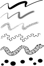
A dialogue box will appear to enable you to give a name to your duplicate. So far I have only had a muck about with the Brush Shape control, and it’s fascinating! You are presented with a range of different “Brush shapes” . Click on one you like the look of and then click on the “Apply brush shape” button at the bottom of the panel. Sure enough, your sub tool now draws with the new Brush shape.

Here’s some examples, all variants on the basic Mapping Pen:

Awesome! And so easy to use! More next ish!

HOW DO YOU DO THAT THEN? – SHADING

How-do-you-do-that-then

RICH SKIPWORTH’S TIPS, TRICKS, AND NERDY TECHNO-BABBLE
One thing that was very popular at the recent Malta Minicon was the “Cartoon Mentoring” session. Some of the lesser experienced cartoonists teamed up with the hard bitten long-in-the tooth professionals for some one-to-one advice on cartooning technique. I paired up with Mitch Mitchell, who was very interested to learn about shading. Mitch was often a bit daunted how to add shading to his cartoons to avoid them looking like just flat pieces of linework. He felt his cartoons would benefit from some shading to make things stand out and make them clearer to read, but he wasn’t sure how to go about it. It struck me that this may well be a common problem with a lot of beginner cartoonists. I remember when I first started cartooning, I would be very reluctant to add shading or colour to my linework in case I messed the whole thing up. So…I thought this might be a useful topic for this month’s “How Do”…

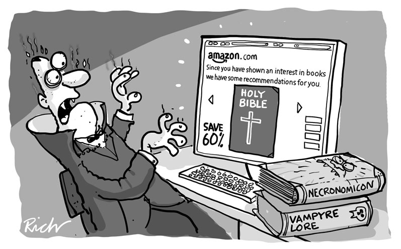
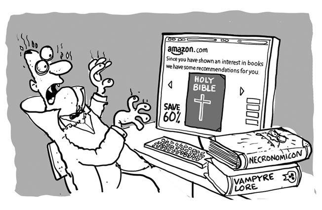
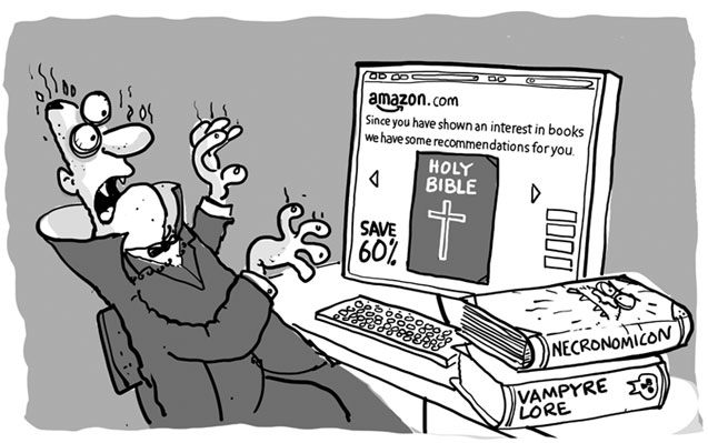
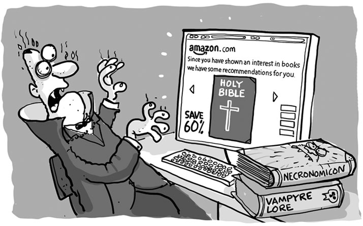
It’s not always necessary to add shading to a cartoon. Plenty of cartoons look great as just simple open black line illustrations. But often they can be improved and given more visual punch with shading applied. Here’s an example: The top pic shows the basic open line version of my cartoon of Dracula browsing Amazon books online. Looks ok, but with some shading added it really stands out on the page..

drac-linework

drac-final

So how do you decide where to put the grey tones, the shading?

First you need to consider what is important in the cartoon, what parts of it really carry the gag. Second, you need to consider where the light source of your cartoon is. In this case, the important bits are the computer screen, and the reaction of Drac to the image on screen. The light source in the picture is easy to work out, it’s the screen. Anything that’s illuminated by the light source will catch the eye and stand out, but make an object appear illuminated, you need to add a contrast between the object and the background. In other words, lighten the bits you want people to notice, darken the rest. You just have to imagine the light hitting your object, and imagine how it might look. Here’s the steps involved in the Drac cartoon shading:

1. With the Drac cartoon, I added a flat grey to the background which immediately threw everything else forward.

drac1

2. Drac wears a dark suit, so the grey of the backgound needed to be lighter than the suit.

drac2

3. Next came some shading to indicate how the light was falling on Drac. Just adding some greys to the parts of the figure away from the light source did the trick.

drac3

4. Next, I dulled down the auxilliary details of the cartoon, which in this case were the books on the desk and the desk itself. They were secondary to the gag, so a bit of grey reduced their prominence, and kept the focus on Drac’s face and the screen. A little extra shading in the form of a dark curve running over the top left of the background gave extra emphasis to Drac’s face by increasing the contrast between his eye area and the background.This also gave a rough impression of the light falling away from the screen towards the left edge of the cartoon, so giving a bit more emphasis on the screen itself.

drac-final

In all these steps I’m constantly trying to get the reader’s eye to be focussed on the important bit: the gag itself Shading of this type is easy when working digitally. For this cartoon, all the shading was done on separate layers in Photoshop, with each layer set to “Multiply” The opacity of all these shading layers could be adjusted to give the best balance between the various tones. Working on paper with pen and ink is a bit trickier of course. I always used to work out the shading positions by overlaying a sheet of tracing paper on the cartoon linework and quickly sketching in the shading with a pencil. Once I was happy I’d got things roughly right I’d use the overlay as a guide and add the tones for real using grey washes of watercolour.

This article first appeared in issue 496 of the Cartoonists’ Club of Great Britain magazine ‘The Jester‘ 

How Do You Do That Then? – Christmas Cover

How- do you do that thenRICH SKIPWORTH’S TIPS, TRICKS, AND NERDY TECHNO-BABBLE
This article first appeared in The Jester issue 472.

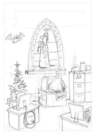
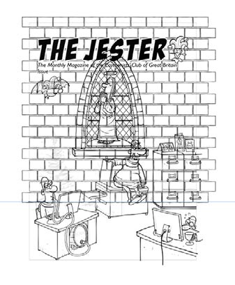
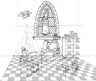
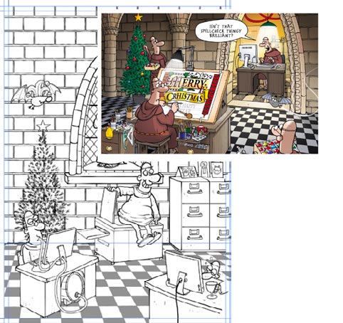
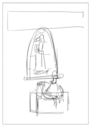
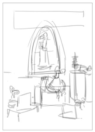
This issue, I’m going to attempt to show the essential steps I went through to complete a cover illustration for The Chistmas Jester in 2013. The theme was “Saints and Sinners” and Ian had asked that I do a cover featuring my Monks characters. Here’s how the whole thing went (I’ve simplified it a bit to fit everything in and to avoid boring you all to tears…)

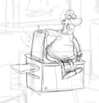
[threecol_one] how to xmas cover step 11. I had a basic idea fairly quickly. Here’s my first sketch In Photoshop [/threecol_one] [threecol_one]how to xmas cover step 22. I thought it needed a bit more going on, so I scribbled in some more. [/threecol_one] [threecol_one_last]how to xmas cover step 33. Those loose scribbles were enough to tighten the detail on another layer. [/threecol_one_last] [hr] [threecol_one] how to xmas cover step 4a how to xmas cover step 4b

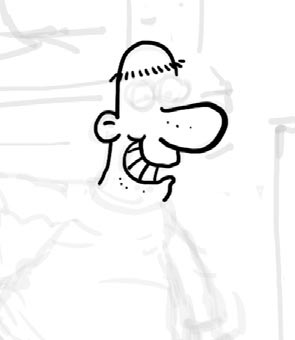
4. Opacity of the sketch layer is dropped to about 20% and inking is done on a layer above [/threecol_one] [threecol_one]how to xmas cover step 55. Some backround detail is manufactured in Illustrator, like the background wall blocks. This pattern is”expanded” so the lines become filled areas, and then a “Roughen” effect is applied. The result is copied and pasted back into Photoshop
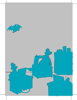
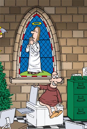
[/threecol_one] [threecol_one_last] how to xmas cover step 6 6. Here the floor tile pattern is created in Illustrator, roughened, and copied & pasted into PS. The opacity of the pattern is lowered so I can see what’sgoing on,and then the Free Transform tools are used to bend the pattern to fit the perspective of the scene.[/threecol_one_last] [hr] [twocol_one] 7. When the inks are done, a separate layer is created above it and the main areas are filled with a flat colour. how to xmas cover step 7 [/twocol_one] [twocol_one_last] 8. This layer then has its transparency locked, and is dropped below the inks layer. It is then filled with white. This layer will then receive the majority of the full colour work for the illustration.

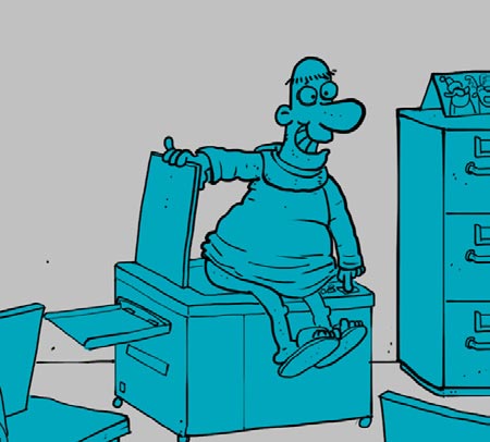
Having a distinct pre-prepared layer to accept the colour allows the colouring to proceed very quickly. You can use rapid strokes without fear of “going over the edges”.how to xmas cover step 8 [/twocol_one_last] [hr] 9. To maintain a consistent palette with my Monks cards I’ll often use a previous design and select key colours from it using the eye-dropper.

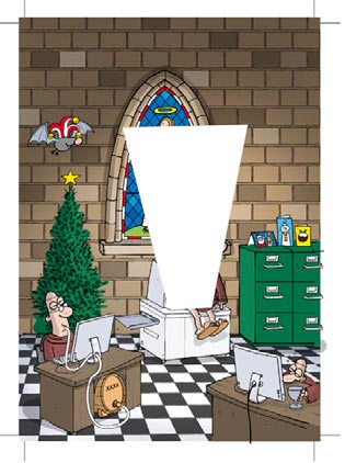
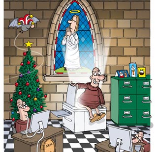
how to xmas cover step 9how to xmas cover step 9b [hr] [twocol_one]10. For the photocopier light effect, I created a new layer and filled a trapezoid shape with white. This was then given a Gaussian Blur of a few pixels and dropped behind the character… how to xmas cover step 10a[/twocol_one] [twocol_one_last]11. …A layer mask was applied to this layer, and black was airbrushed onto it which had the effect of reducing the opacity where the black was applied. On another layer, on top of the character, I carefully airbrushed some white to give the impression the light was leaking around the Monk’s bum. how to xmas cover step 11[/twocol_one_last] [hr]

Working on layers is the key to the whole process, though I probably over do it. For this illustration I wound up with 35.

More nerdy stuff next time!

Happy Christmas!

jester cover 472